Showing posts with label projects. Show all posts

The Portrait - Digital Final

For my final in Digital Imagery, I wanted to experiment with expression.  My camera was set to shoot continuously and I would shoot for several minutes.  I didn't let my subject know my whole idea, like the fact that this was an experiment where I would see how their expression changed.  I just told my subject that I wanted to do a portrait and it would take several minutes of shooting.

I originally was going to present this in a grid format, but ended up not feeling that was the right way to present what I wanted to show.  So the idea of doing this in video format was exciting and something that interested me.  

Over the course of shooting for this and editing (approx. 450 pics I went over several times), I discovered quite a few interesting things:  at the beginning of the video it feels like my subject is being goofy to hide his uncomfortableness in front of the camera, after a few minutes of shooting is where things begin to get interesting (after about 4 minutes in the video), I can see my subject getting slightly bored of all the shooting, then begins to feel comfortable enough to engage the camera closely and genuinely laughs.  Also when I was going through watching the video, I would find myself laughing when my subject laughed or even feeling bored when he was, it could have been because I was present when I shot all these photos, but it was a cool experience for me.

I'm posting another video that I hopefully can dig into more later, and it was just cool to watch when I was reviewing my photos, I went through the photos several times enjoying the flipbook in chart form feel of it.


Experimental: Intervention

This project my class could pick from fabrication, sculpture, or intervention in photography.  Mine crosses the borders on each of them.  I was interested in lenticular printing, what image might be caught in the middle when flashing between the two.  When I shot the underwater shoot, I also shot quite a few pictures of my sister falling into the water, and felt that these sort of splashes created a kind of sculpture for me.  I wanted to place them in a landscape, so I overlapped the splash photo with one of a landscape that I took.

Color Theory Project 1: Saturation

I realized I have not put up any of my work from my Color Theory class this last semester. It certainly was one of my favorite classes and was very interesting to me how colors work together and how our brain perceives them.

We did a lot of exercises this semester to help prepare us for these projects. This first project was fairly easy, what was mainly difficult was deciding what to do. We needed to basically create a poster, but one using all fully saturated colors. My teacher for this class, Jeff Atherton, is pretty awesome. He helped me out a lot picking colors and whatnot. I chose to do my posters on sea monsters just because they're cool and like destroying stuff. And I really wanted to go with yellows and turquoisey blues, but with sea monsters that wasn't going to work. I needed angry, menacing colors. That's where the red comes in and it was fun.

All our projects this semester needed to be painted. I had painted with acrylics before, and they are temperamental and difficult to deal with, but I started to get the hang of it and enjoyed actually painting with acrylic, I did surprise myself a lot this semester. One goal I had was to do my best and stick with doing what I wanted, and it worked for me.

This project, I kept it graphic. So I painted giant swatches of a single color, then drew my own stencil, traced it over the colors, cut them out, and glued them together. Simple.

During the critique, when it came to my picture, I saw that the boat I had in the middle looked like a shark fin because of my last minute decision where I had decided to paint it gray. Everything else I like and my teacher did as well, and we mutually agreed that the middle (where the boat was) needed to be fixed. So instead of going through and repainting everything, I just scanned it and edited it on the computer in Photoshop. Voila! The final product is much better. :)

Color Photo Class: Portraiture

I had a 5 hour critique yesterday for my photo class, and I'm sure some art students have been in longer, but that was the longest I've ever had a crit for, and it was long I reassure you. I do like crits because of the helpful feedback I get from my more than qualified instructor who has this valuable insight and also from my classmates.

I'll be honest my project doesn't really have a concept too much behind it. I decided to shoot pictures of people that are somehow involved in my life and it was for the most part candid, trying to catch them in a moment, a snapshot. It was more of an experiment, and I used flash on all the pictures I turned in. I discovered while shooting (at the last minute) that I really like flash and decided to shoot the rest of my pictures using that.

My teacher said that technical wise my flash use was good, but she thought my previous work in previous classes was more imaginative. And I agree with her, I know she's right. I did however, have a few different ideas for this project, some didn't turn out the way I liked when I shot, and the one that I think would have possibly worked, I didn't have time to shoot (yes, because I procrastinated). So I can always resubmit, but it is not like I didn't like my photos. I absolutely do, but conceptually there's not much there. Some questions I need to ask are: How can I use the snapshot form in a different way? Possibly exposing our social tendencies. How should my flash be used? And that I could add more context into my pictures instead of cropping them so closely around the person. So quite a few options to push my work further.


Poetry Class Final: Book


Such a busy time finals are! Well I'm back and just before Christmas too. Not really any x-mas special this year, but I will be sharing my final project for my poetry class - a book we had to make. There are many crazy and crafty ways to make a book, but for something where I would put my poetry I wanted to keep it simple.


I used a black textured cover and off white, parchment style paper with an old looking, imperfect typewriter font that I felt gave my poems "texture." My friend helped me find the fonts at FontRiver. This site has been around for years and I've used it in high school as well, it's addicting looking for fonts. Anyways, download them for free here and if you use a PC, you find the "fonts" folder in Windows and just place your fonts there and they should show up in Microsoft Word. Easy, eh?

The two fonts I used are Underwood, and Telegraphem for headings and such. To make the book, my friend and me got a bone folder, and awl, some spray adhesive, and nice papers. Some other things that come in handy are and exacto knife, Alvin cutting mat, t-square ruler, and metal ruler preferably.


From there I began crafting, the page size is 7" x 5.5." For the document, my friend helped me create it in Microsoft Word. I would prefer to use Adobe InDesign since you can have an easy book setup to create your book, but it was not available to us at the time. The new Word worked surprisingly well in my opinion.

Anyways, we used the 12 page book template and set up our page sizes and margins we desired from there. Printing was simple, you set it up to be manually printed double sided, let everything print, then stick all the pages back into the printer the exact same way it came out. In other words, you don't have to change anything.

After that, I cut down my page sizes, and used the handy bone folder to fold everything in half, then the awl to poke 3 holes in the spine, then I just winged the saddle stitch through my first booklet and the second, then through the inside cover. I then glued that to the outside, nicer, textured paper. For the title I would have like to have hammered the letters in and made the title indented, but being out of money for this, I embossed it instead (which is pretty much the opposite of indenting something haha). Oh, and I have a thing for vellum, I love using it in projects, so I decided to incorporate it in my book as the title page for each poem.

So with this book finished and even though the measuring was a little off, I'm still proud of my beautiful book and plan to make more in the future, probably with a section of my pictures.

Organizer

After creating my AP Studio Art portfolio in my senior year of high school, I was asked by my teacher to create the following school year's planner. Of course I agreed, it was exciting I would get to design something the whole school would use! Mwahahaha! I photoshopped some pics and put it all together in photoshop. Here it is. :)

My Graphic Pieces and Process

A while after I had learned to use Photoshop, the fun part was and is to experiment. I really liked working with the filters, such as cutout, film grain, etc. My process when I create my graphic pieces is I first of all use all of my own photos 97% of the time, then I cut them, use the gradient, put them together and layer them playing with various filters for each layer. For example, layer 1 could be cutout, then on top of that I'll put layer 2 using film grain on another picture. I'll also play around with opacity (how transparent I want the layer to be), then mess around with what setting I want the layer to be on such as: normal, hard light, dissolve, saturation, soft light, etc. I'll basically play around with all these effects and the order of layers until I get the picture I desire or want. Of course, I will probably have saved 10 different versions of the same picture where the layering may be different or one effect may be, but I like both. After I pick a final one I like, I'll probably tweak it if need be with adjustment layers if I hadn't already. So that's the jist of how I enjoy creating my own work. It started about my senior year of high school 2007 or so and I created many of my works with this method and love doing so. The piece below is my most recent one, done in early 2009 I believe, so I need to jump back into that, I've been mainly working with straight photos lately. I created this on my own time, not for a class or anything. I believe this piece has at least 6 or 7 different pictures, all ones I took. If you have any questions about this just ask! :)


Photo Project: Assingment 1 Anti-Cliche

I'm already working on my second project now, but earlier this semester, for my intermediate photo class, our first assignment was to photograph things not normally seen, things that are anti-cliche. Everyone first presented what was seen as cliche today, such as: the myspace type profile picture we've all made, the large flowers with bees, family portraits, swirling staircases, sunsets, that sun glare everyone seems to include in their photos too, waterfalls, beaches and palm trees, tree lined walkways, etc etc. I've taken all these photos too I admit, much of my beginning works dealt with bees and flowers close-up. I was so fascinated with close-up and that I could be next to a bee and catch it on camera! I'll have to post those pics sometime. But it is fascinating because what we see as cliche now was not considered so at one point, also, what we see as new and inventive now, will at some point become cliche because everyone will be wanting to make those pictures.

Anyways, I started just going out and taking pictures at Disneyland, then inside my house. We have a giant (I'm sure almost every asian family has this) family portrait by our front door. I played around with this idea of blurring out the faces in the picture. You can still see the blurred silhouettes, but no detail, like that family portrait means nothing, it could be anybody's family, no one would know.

Another picture I used a cup and had my sister hold it against the kitchen light, it looks more like a graphic piece, I was just playing around with different things to create various effects in a picture. Note: these are scans from my negatives, not scans from the actual prints themselves.

Life Drawing Class: Portraiture and Final

Even though I'm no longer in life drawing seeing as the class ended in May, I have made note I am quite a few months behind on my blogging and am going to be catching up for a while. After gestures and drawing the figure, my class moved onto portraiture. I was not at all very good at drawing face accurately, but after I learned how to do this, I was amazed at what I could do.

We would still start with marking where things were and drawing a triangle to get a feel where the forehead and chin were. Then we would carve out the light from the charcoal, then gradually move onto detail. First starting with a chamois then moving up to finer tools such as an eraser. So here are some of the portraits I did (keep in mind some of them are unfinished since the models we had in class were only there for a few periods).


For my final, we had to do a self portrait, mine doesn't look like an exact representation of me for those that know me. Yet I did it in 7 hours and spent more time brainstorming about the piece. I chose a blue toned paper to bring this feeling of melancholy, and I wanted to focus on this one feeling because that was all I was thinking about. I was somewhat depressed during this time. I got a hold of a broken mirror (thanks to my dad) and cropped it so the cracks would be at the edge and cause this sort of tension and uncomfortableness, also that the cracks, spider web like are creeping into the picture. It represented this chaos and distortion, brokenness and sadness. I had one light source and the things in the background I blurred out because they didn't matter, at the time I didn't care about anything else. We were supposed to spend about 20 hours on it, but my teacher loved that I put thought into almost every little detail. Yay for a good semester of life drawing, one of the best classes I've ever taken :)


Want a Piece? My Rebel Re-Label Project

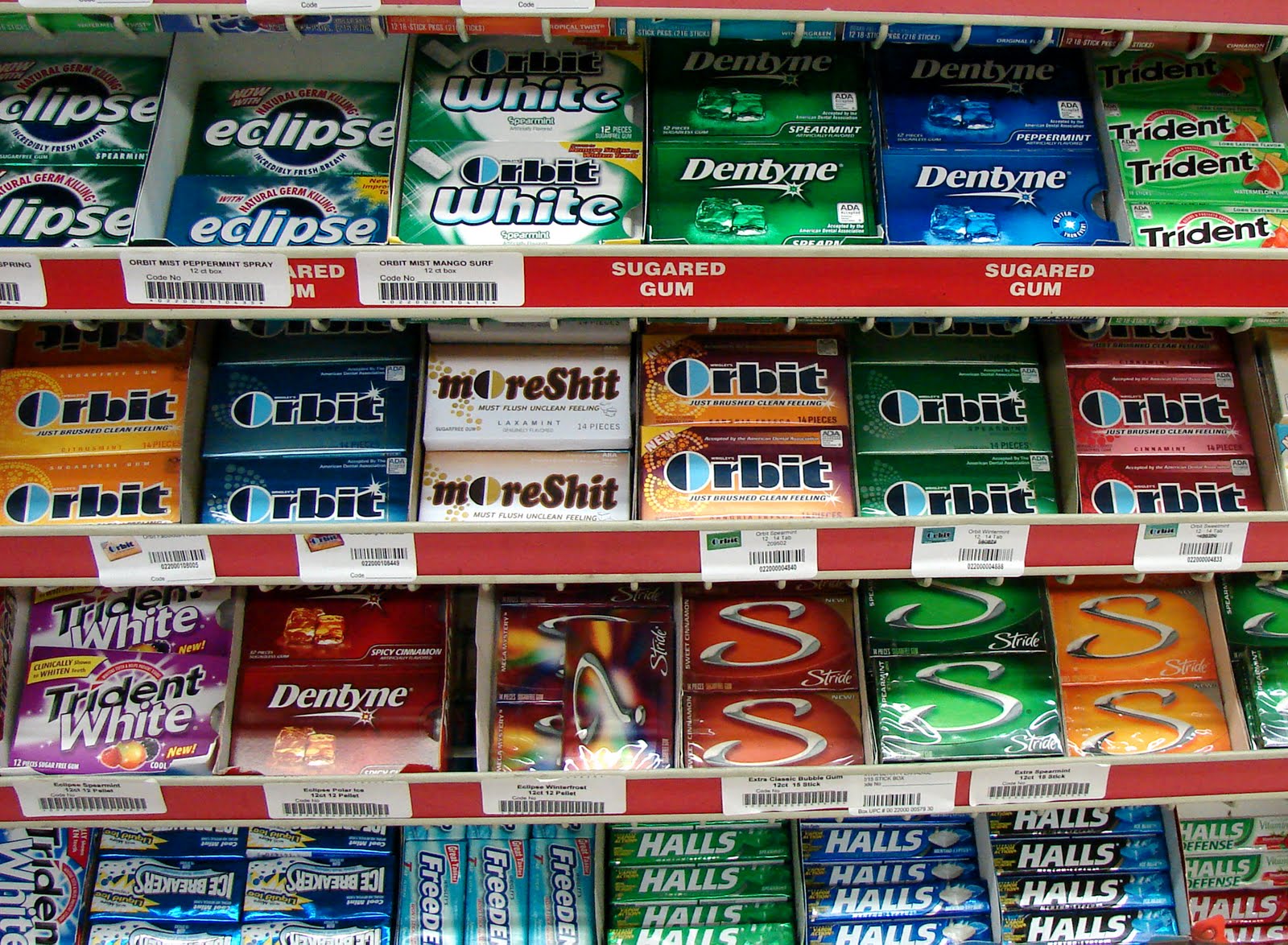
So I did end up sticking with Orbit Gum for my product project. My best friend helped me come up with a name as long as ideas. Since sugarfree gum contains sugar alcohol, if eaten in excess, this can cause diarrhea. Sadly, I've tested this and it proves true. So I've renamed my product MoreShit! A sort of half rhyme with Orbit, and it now (in my fantasy world at least) comes in Laxamint. Which by the way, in my search about different things for Orbit, I've found that laxative gum already does exist, so my product will have a spot on the market. Heh heh.

My bestie also gave me the idea of a sort of Bertie Bott's every flavor theme, which I think is another great idea considering Orbit gum has every unnecessary flavor out there possible.
After I finished my product, I wanted to see how it fit back into the world! I went to the liquor store by my house, asked to place it on the shelf, I did, and photographed it. Oh, my bastard child from Orbit fits so well into the gum social scene.

Some technical stuff if I must, I created it in illustrator, I found an Orbit box template off the internet (thank God for the internet) and I just used the box outline. I pretty much started from scratch. except for the ying yangish "O" logo in Orbit. That I used Live Trace and recolored it. I created a signature in high school in illustrator, but that's about all the work I've done in Illustrator. So this project I shall say was a bit of a learning experience. A good one mind that, and I tried keeping it simple for myself. Anyways, hope you find some humor from it, and enjoy. :)


My Future Project

A Decaying Society (my bestie came up the title, it rocks ;). A society in the future that is and isn't literally decaying. Think of the movie Wall-E, it's similar in the fact that people wouldn't be seeing the world around them let alone each other. Same idea in my pictures. People are so consumed with this newspeak and by communicating through texting (entire conversations mainly, rather than what it used to be for, just short informative messages like "we're here," so that someone wouldn't have to waste their minutes for a couple second phone call). To go a bit further with my idea, in this very digital world, people communicate more without hearing the other person's voice or even seeing them face to face, and I could go on and on...

So I decided to do a series, and when I printed them, I printed them as shown below, from smallest to greatest to emphasize the escalation of this situation in the possible future (another great idea from my lovely). I mounted each picture approximately an inch apart with borders on a black foam board. One thing I learned is that I'm not cutting the board with a utility knife again, I ended up butchering the edges, it's just gonna be super sharp exacto knives from now on. Anyways, I did enjoy doing this project, it was a lot of cutting and pasting, and I went through several ideas about the detail of the pictures, but I like the final product and am glad I had an idea I stuck with.


I wanted to stick with the pictures looking like they are documentary type photos, like I'm documenting the world and people at the time. I made it black and white, and normally I like very contrasty pictures, so I had to try and refrain from doing that too much because I wanted the photos to look dull and flat, like the bland text message blobs as each person's head. Things aren't as interesting or as lively. I do think I should have blurred the background a bit more, to obscure the scenery because it's not important to the people in the photos. In the ad (I contemplated how to go about this) I decided that I would make him faceless, because as a picture (within my picture) he is not communicating with others, but it goes to show that people don't see people anymore, they don't see details, etc, etc. So those are just some things about my project, hope you enjoy and I do appreciate feedback :)
My Life Drawing Class

In my class, we're always looking for shapes and negative shapes in the figure and in the interior around the figure. Using architecture around the model is very helpful in seeing where and how he or she is positioned. Many of our gestures are done in 2-5 minutes, with an occasional generous 10 minutes to check, recheck, and observe.

At the beginning of the semester, there was a basic formula my class was taught and followed.
1. Draw a center line (following the body, from base of neck to usually an ankle, depending on the pose)
2. Draw a platform line (establishes width of pose/distance between feet)
3. Draw a skirt (of legs) up to pelvic line
4. Draw a triangle from pelvic line to base of neck
5. Draw the shoulder line (usually at base of neck, if drawing the back, it would be lower, you'd draw the triangle to 7th cervical)
6. Draw the center line through the head
7. Draw the orbital line

In my class we want to stick to traveling along the center line (which can be changed or shifted if needed). It's like Main Street for us. After understanding the torso (establishing where navel is and nipples, etc) and breaking everything into shapes, we want to break at the joints (knees, ankles, elbows, wrists, etc). I've learned so much from this class and am starting to draw and notice things in a different way than before.
Front and back gesture of the same pose.

First drawing my class completed of the model laying down, using the platform to help.

The last drawing I worked on.
In my class we're starting to look at muscle groupings and planes of the body. The human body is so fascinating! I'm feeling better and more confident in drawing the figure, something I did not think I could do before, well at least not very detailed or as accurately.